Best Diamond Color for Emerald Cut: G–H Sweet Spot
What diamond color is best for an emerald cut?
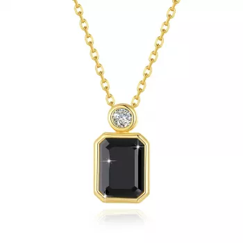
Emerald cuts tend to look best in the colorless-to-near-colorless range because their large, open facets act like windows that can reveal body color more easily than brilliant cuts. For most shoppers, a sweet spot is typically G–H: it reads bright and clean in many settings while offering better value than higher grades.
Why emerald cuts show color more than other shapes
Unlike round brilliants that “hide” tint with intense sparkle, emerald cuts produce broad flashes and long reflections. That elegant hall-of-mirrors look is exactly what makes any warmth easier to notice, especially when the stone is viewed face-up or compared side-by-side with whiter diamonds.
Recommended color grades by metal choice
Platinum or white gold: D–F gives a crisp, icy look that matches the cool tone of the metal. G–H can still appear very white, but the setting won’t help mask warmth the way yellow metals can.
Yellow or rose gold: G–I often works beautifully. The warmer metal can visually blend with slight tint, making an I look more intentional and vintage-leaning rather than “off-white.”
When to go higher (or lower) on color
Choose D–F if you’re very color-sensitive, you want maximum contrast in a white-metal setting, or you’re pairing the center stone with very white side stones (like baguettes) where mismatch can stand out. Consider H–I if budget is a priority, the diamond will be set in yellow/rose gold, or you prefer a softer, romantic tone.
Don’t ignore clarity and cut quality
Emerald cuts also reveal inclusions more readily, so balancing color with a clean-looking clarity grade can matter just as much. Prioritizing a well-cut emerald with pleasing proportions and strong light return often does more for beauty than chasing the highest color grade.
For a deeper breakdown by setting style, budget, and how to judge warmth in real life, see the main guide: https://prince.sale/what-diamond-color-is-best-for-an-emerald-cut/.
FAQ
Does fluorescence affect how color looks in an emerald cut?
It can. Medium to strong blue fluorescence may make some near-colorless diamonds appear a touch whiter in daylight, but in rare cases it can create a hazy look—so it’s best evaluated on the specific stone.


Leave a comment